Summary
I just got back from the Evolution 2016 meeting in Austin, Texas; it was amazing. I’m of course biased because I did my Phd there and basically everyone who graduated in the last 10 years tried to find a reason to be here for this meeting so it was basically a grand reunion party. The science was also fantastic, so now I’m now vacilating about doing yet another postdoc in evolutionary biology or continuing my attempts at getting a data science job in industry without any biology. However, what I’ll be talking about is how to do some simple analysis of tweets, collected either via streaming API or just after a conference via their search API.
I made a small github repo for the associated R scripts so you can just pull the R scripts instead of copying and pasting, or you can do that as well if you like.
Getting tweets, streaming (setup beforehand, all relevant tweets) or search (last 7 days, not exhaustive)
As the head outlines, there are two main ways to collect tweets. The streaming API collects any broadcast tweets that contain a word in the filter list. This makes it easy it filter for events with unique hashtags, as in my case for Evolution 16 which used #evol16. The previous post lays out how to set up a stream pretty clearly I feel. However, having got back from Evolutiabion, I now realize that was only about 15 thousand tweets and maybe not actually needing the streaming infrastructure. Streaming insures you won’t lose tweets, but doing a search after the conference with twitteR will be easier most times. See this website for details at the top, it’s pretty good. They also perform an alternate approach for analyzing sentiment (valence) with the qdap package which I haven’t investigated but is interesting and seems quite robust and actively developed (check out the github). They also do some network stuff which was cool.
To be clear, for conferences or these smaller gatherings I think twitteR is the way to go. For larger events, global conversations (#Brexit, #Olympics), do streamR as the amount of tweets that search can pull back is limited. But even mid-sized conferences will probably only get 15-25K tweets I’d guess (we’ll see, I’m planning on doing this for TAGC in a couple weeks which is a monstrous union of all the all the model organism genetics conferences and there is a LOT of biotech Crispr money flying around there).
Making those sweet figures
The R code should hopefully be somewhat clear. the %>% commands you see might be new, they are coming from dplyr, which is a great package by Hadley Wickham. So, I like making plots with ggplot2, which basically means that your life becomes much easier if your data is in a “tidy” format for ggplot to work with. Packages like dplyr, broom, and tidytext as you can guess, are things that are part of what is somewhat creepily called the Hadleyverse that adopts this framework. What the %>% (called a “pipe”) is doing, is transforming dataframes with somethings multiple commands. For instance, in the code that generates the ‘evol2016_alldays.png’ figure, the tidy_tw dataframe goes through two pipe transformations before being called on the wordcloud function.
The actual structure and formulation of these calls is a bit weird compared to “normal” function calls, but they are really powerful and allow chaining and compact code. That’s the main logic needed to understand what’s going on with the code if you haven’t seen it before. a
library(tidytext)
library(ggplot2)
library(tm)
library(wordcloud)
library(streamR)
library(dplyr)
library(smappR)

setwd('~/tweet-pol')
df<-parseTweets('merged_evol2016.json')
#from http://www.r-bloggers.com/playing-with-twitter-data/
#because I am no good at constructing regexes
#removes http links
#I guess this actually still is causing a memory leak so don't do it!
#theoretically there is some even uglier regex that successfully does this simple task, I just don't know what it looks like
df$text<-gsub(' http[^[:blank:]]+', '', df$text)

tidy_tw<-df %>% unnest_tokens (word,text)
#some of these stop words are unneccessary now that I got a regex working that doesn't core dump
tw_stop<-data.frame(word=c('amp','gt','t.c', 'evol2016','rt','https','t.co','___','1','2','3','4','5','6','7','8','9',"i\'m",'15','30','45','00','10'),lexicon='whatevs')
data("stop_words")

#removes uninformatives words / ones that oversaturate wordcloud (conference hashtag)
tidy_tw <- tidy_tw %>%
  anti_join(tw_stop)
tidy_tw <- tidy_tw %>%
  anti_join(stop_words)

print(tidy_tw %>% count(word, sort = TRUE))

png('evol2016_alldays.png')
fig<-tidy_tw %>%
  count(word) %>%
  with(wordcloud(word, n,remove=c("evol2016"),max.words = 100,colors=brewer.pal(8,'Dark2')))
dev.off()

gah<-tidy_tw %>% count(word)
gah2<-as.data.frame(gah[order(gah$n,decreasing=T),])
print(head(gah2,30))

print(nrow(df))
hm<-sort(table(df$screen_name),reversed=T)
outdf<-data.frame(screen_name=names(hm),num_tweets=hm)[,c(1,3)]
outdf<-outdf[order(outdf[,2],decreasing=T),]
write.csv(outdf,file='evol2016_tweetrank.csv',quote=F)http://www.r-bloggers.com/playing-with-twitter-data/
print(head(outdf))

tidy_tw$created_at<-formatTwDate(tidy_tw$created_at)
df$created_at<-formatTwDate(df$created_at)

library(tidyr)
bing <- sentiments %>%
  filter(lexicon == "bing") %>%
  select(-score)

evol2016sentiment <- tidy_tw %>%
  inner_join(bing) %>%
  count(id_str, sentiment) %>%
  spread(sentiment, n, fill = 0) %>%
  mutate(sentiment = positive - negative) %>%
  inner_join(df[,c(6,10)])

library(cowplot)
library(scales)
library(lubridate)
df_labels<-data.frame(times=strptime(c("2016-06-15 18:00:00","2016-06-17 12:00:00","2016-06-18 7:30:00","2016-06-19 18:30:00","2016-06-21 0:00:00","2016-06-21 18:00:00","2016-06-23 0:00:00"),"%Y-%m-%d %H:%M:%S"),
                      labels=c("anticipation","pre-conf\nworkshops",'conference\ntalks begin','film festival\nsocializing','oh god\nmore talks',"super social!",'bitter\nreality\nintrudes'),
                      y=c(-.1,.7,-.1,.85,0,.55,1.05))
p<-ggplot(evol2016sentiment, aes(created_at, sentiment)) +
  geom_smooth() + xlab("tweet time") + ylab("tweet sentiment")+
  scale_x_datetime(breaks = date_breaks("day")) + background_grid(major = "xy", minor = "none") +
  theme(axis.text.x=element_text(angle=315,vjust=.6)) +
  coord_cartesian(ylim=c(-.5,1.2))+geom_text(data=df_labels,aes(x=times,y=y,label=labels),size=4)
print(p)

save_plot("evol2016_sentiment_time.png",p)

p2<-qplot(outdf$num_tweets.Freq)+scale_x_log10()+xlab("number #evol2016 tweets")+ylab("number of tweeters")
print(p2)
save_plot("evol2016_numtweets_user.png",p2)i
The first figure produced is a wordcloud. These are in reality not very informative as placement in the cloud can skew interpretration of rank, but they are still visually appealing so everyone makes them and wants to look at them, including me. Haters vacate, I say. It does lead to a painfully pixellated figure being produced, unfortunately- it shouldn’t be this way but I can’t figure out how to get the wordcloud to do something smarter without breaking. So I guess this is I guess a hint to just not use wordclouds after all.

The second figure was the one I spent the most time on, and is a plot of twitter “sentiment” through time. If you haven’t heard of sentiment analysis, well, you can be prepared for a deep dive if you want. The basic idea is simple, where we are trying to understand basic emotions of sentences, paragraphs, or in our case, tweets.
I put labels on some of the major events of the conference that I could think of that would likely be driving emotive tweets during times (generally the evenings). I was pleased that there was generally a nice diurnal cadence to the sentiment where it would fall to kind back near to the neautral 0 baseline, then creep back up in the evenings (seen by the faint vertical lines marking midnights). The exception was 06-22 – where emotion fell during the evening – is something to look at when/if I have time.
However, I didn’t take the time to actually groundtruth any of these intuitions, so it leaves in many ways a lot of room for improvement. I saw a recent post doing a similar analysis of the International Coral Reef 2016 Conference by Dr. Kirsty L. Nash which was quite fascinating and improves on my attempts in most ways and actually asks an interesting question too: are coral reef biologist bummers to be around? Her analysis actually dives into what is being talked about during the highs and lows during the conference, which I quite liked. Plus, she actually describes sentiment analysis a bit, which I still have yet to do here (maybe one day).
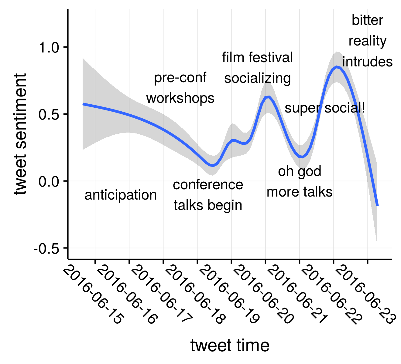
There are several caveats to this figure. First, this was produced using what was using what is known as a “bag of words” sentiment corpus. You can get fancier by analyzing the tweet/sentence as a whole, but that’s a separate analysis. I guess that’s all I really want to get into.
To summarize, in the real business world there are way fancier linear regression/ sentence or n-gram ways to look at language, but more importantly – be careful about overinterpreting the silly bumps and curves in your trend lines!
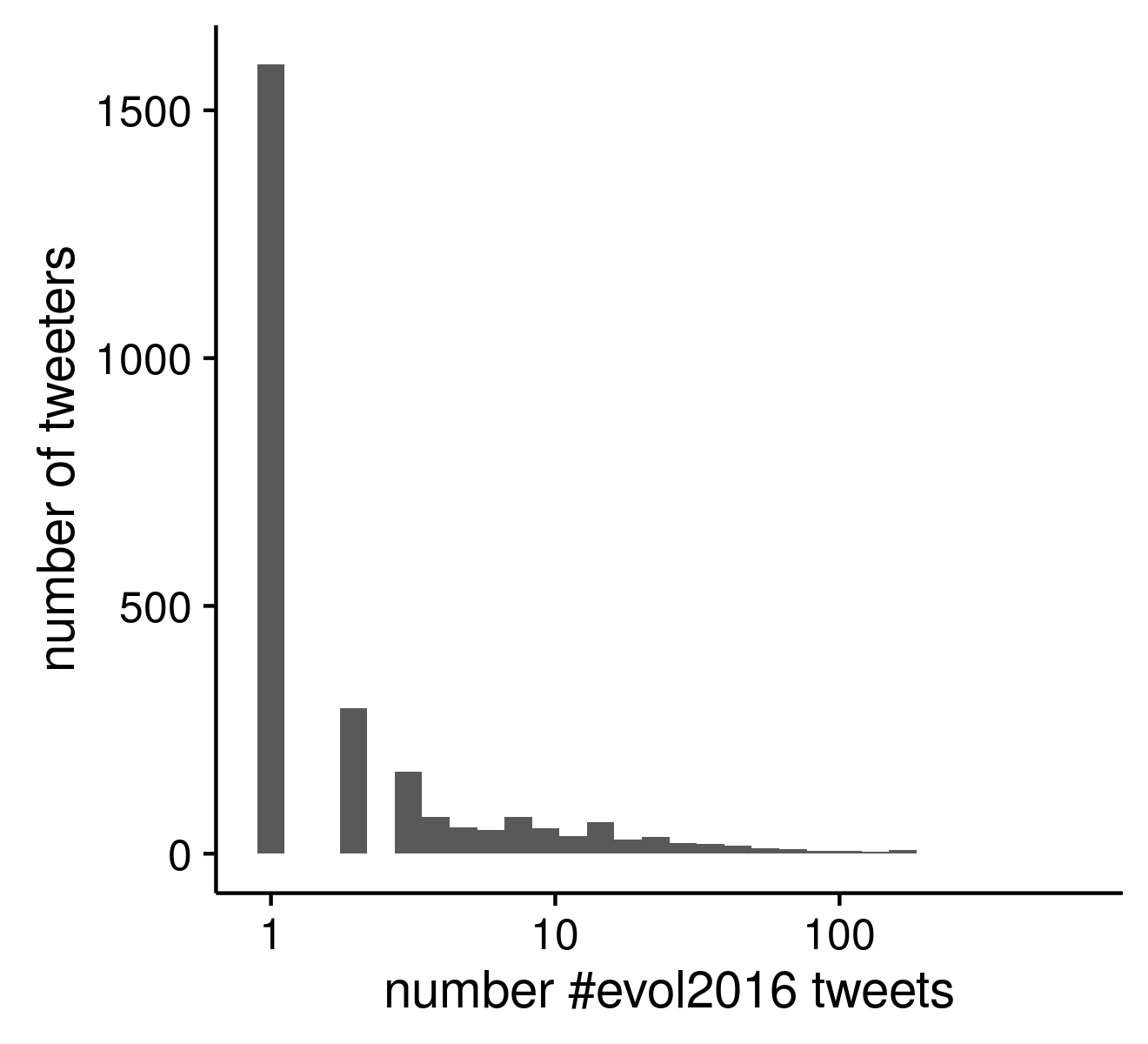
The third figure is just the inverse relationship between the frequency of users during the conference with that number of #evol2016.
Update 2016-07-06
The final analysis I wanted to do was some kind of network figure so I finally live the dream and capitalize off the lab meetings I attended of Lauren Ancel Meyers. In a cruel twist of fate I did come down with something towards the end of the conference, so it was 100% part of the contact network, but WHO WAS IT???
The Cool as Heck (I think anyhow) Evol2016 twitter retweet network
It took several days longer than I initially expected to get this working, but overall I’m pleased with the results. Mostly this was a result of completely forgetting how all network stuff works and then wanting to use something pretty instead of networkx, which I don’t really remember how to use anymore and is python anyway. Python is great, but I had decided that I wanted to make a pretty visualization and therefore it had to be something real, real nice. ggraph stands out as a pretty great package right now for making crazy-pants networks if you are willing to work with some beta-level documentation. It is made by Thomas Pedersen who is frighteningly good at biology and R, and nice to boot! There is a crazy amount of functionality, as it seems to duplicate a large amount of igraph which is a massive network package, but the two main sites I can find so far through my admittedly subpar googling are the linked ggplot2-exts and the https://github.com/thomasp85/ggraph.
Don’t get me wrong, there are already quite a few diverse examples and they are great, I just think there is room for a bit more hand-holding at some point.
I opted for mostly boring defaults. I suppose that defeats the purpose of using ggraph, which is built on the guts of ggplot2. I suppose I should be making something to vomit rainbows over the screen, but a rather plain lightly shaded network will have to suffice for now. I did come across this website that had some good examples on how to get down and dirty on modifying the arrows for directed networks and coloring nodes with different classes. I included my inline annotations that hopefully explain the logic of the R code a bit. Some of the retweet network was recycling someone else’s code and I’m sure could be/has been done cleaner; I’m all ears to better implementations. This was always meant to be “a quick afternoon project.”
The interpretation
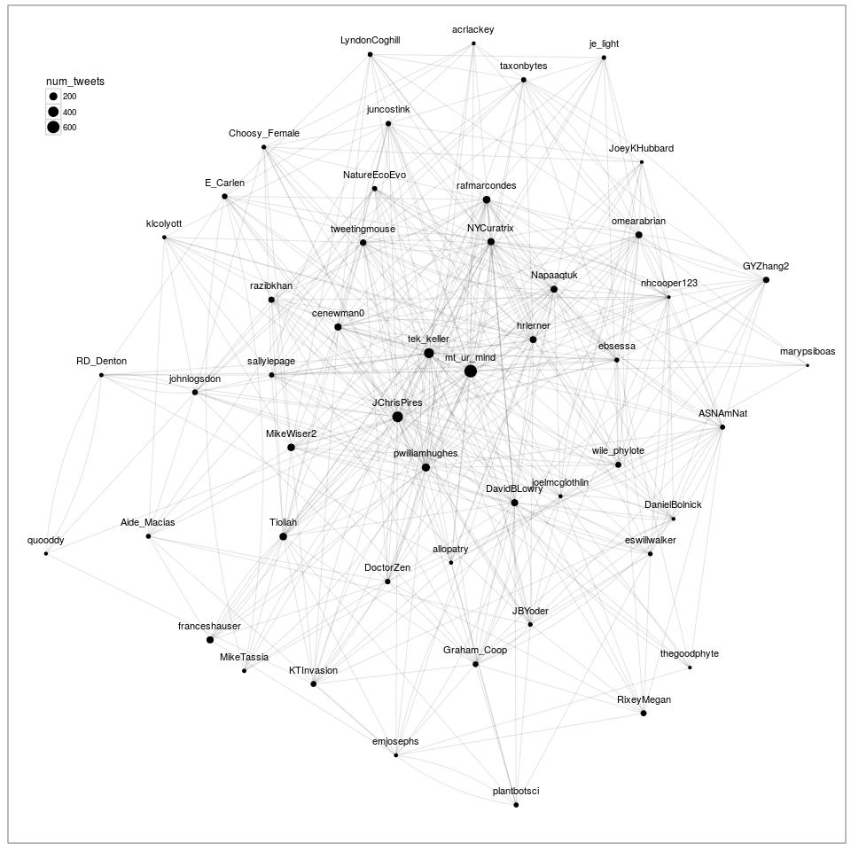
Well, there are a couple features of a network to know about immediately. Most of these layout algorithms do some form of force-directed choice which tries to minimize the “energy” of the network system by placing nodes (here, people) with high numbers of connections closer to the center of the network drawing and those with relatively fewer connections towards the edge of the drawing.
One thing I was considering was trying to do some kind of temporal network that lights up through time to highlight the individual cliques and the sub-interests. This overall figure is not actually that useful or interesting as is. It’s just a starting point visualization. But I still think it looks pretty cool. I didn’t really play around much with trying to add more people into the network to see how dense I could make it before it became a giant blob. This tutorial by Katya Ognyanova might also come in handy if you start playing around with ggraph, as it mimics most of the igraph API.
Also, ggraph can be pronounced Giraffe, how cool is that (it’s mighty cool, thank you very much).
library(tidytext)
library(ggplot2)
library(tm)
library(wordcloud)
library(streamR)
library(dplyr)
library(smappR)
library(qdap)
library(qdapRegex)
library(igraph)
library(stringr)
#####
###

#This is the redux parsing to generate the basic word lists per tweet
#assuming a clean starting point separate from any of the upstream analysis
df<-parseTweets('merged_evol2016.json')
#from http://www.r-bloggers.com/playing-with-twitter-data/
#because I am no good at constructing regexes
#removes http links
#nope this is still causing an oom runaway somewhere
#OK, these guys (qdap) actually do text parsing for reals
#welp, that still breaks the unnesting, so frick it
#df$text<-rm_url(df$text)

tidy_tw<-df %>% unnest_tokens (word,text)
#some of these stop words are unneccessary now that I got a regex working that doesn't core dump
tw_stop<-data.frame(word=c('amp','gt','t.c', 'evol2016','rt','https','t.co','___','1','2','3','4','5','6','7','8','9',"i\'m",'15','30','45','00','10'),lexicon='whatevs')
data("stop_words")

#removes uninformatives words / ones that oversaturate wordcloud (conference hash)
tidy_tw <- tidy_tw %>%
  anti_join(tw_stop)
tidy_tw <- tidy_tw %>%
  anti_join(stop_words)


outdf<-data.frame(screen_name=names(hm),num_tweets=hm)[,c(1,3)]
outdf<-outdf[order(outdf[,2],decreasing=T),]

#OK, start of new code to develop RT network
#code (regex especially!!!) used liberally from
# https://sites.google.com/site/miningtwitter/questions/user-tweets/who-retweet
rt_net<-grep("(RT|via)((?:\\b\\W*@\\w+)+)", df$text,
             ignore.case=TRUE,value=TRUE)
rt_neti<-grep("(RT|via)((?:\\b\\W*@\\w+)+)", df$text,
             ignore.case=TRUE)

#next, create list to store user names
who_retweet <- as.list(1:length(rt_net))
who_post <- as.liset(1:length(rt_net))

# for loop
for (i in 1:length(rt_net))
{
  # get tweet with retweet entity
  #nrow= ???
  twit <- df[rt_neti[i],]
  # get retweet source
  poster<-str_extract_all(twit$text,"(RT|via)((?:\\b\\W*@\\w+)+)")
  #remove ':'
  poster <- gsub(":", "", unlist(poster))
  # name of retweeted user
  who_post[[i]] <- gsub("(RT @|via @)", "", poster, ignore.case=TRUE)
  # name of retweeting user
  who_retweet[[i]] <- rep(twit$screen_name, length(poster))
}

# unlist
who_post <- unlist(who_post)
who_retweet <- unlist(who_retweet)

####
#Preprocessing the dataframes as as contacts to something
#igraph likes

#I guess I need an edge aesthetic for ggraph to paint with
retweeter_poster <- data.frame(from=who_retweet, to=who_post,retweets=1)

#filters out some bad parsing and users who arent in the node graph
#node_df has the screen_name and number of tweets per user, which will serve as the vertex/node dataframe
#in igraph speak
node_df<-outdf
names(node_df)<-c("id","num_tweets")
#This step #REALLLY IMPORTANT# for plotting purposes, determines how dense the network is
#need to tune based on how big you want your input network is
node_df2<-droplevels(node_df[1:50,]) #selecting only the top 50 posting from #evol2016 for plotting purposes
filt_rt_post<-retweeter_poster[retweeter_poster$from %in% node_df2$id & retweeter_poster$to %in% node_df2$id,]
filt_rt_post<-droplevels(filt_rt_post) #ditch all those fleshbags that had to talk to people instead of tweeting
head(filt_rt_post)

#this creates a directed graph with vertex/node info on num_tweets, and edge info on retweets
rt_graph<-graph_from_data_frame(d=droplevels(filt_rt_post),vertices=droplevels(node_df2),directed=T)

#simplify the graph to remove any possible self retweets since now twitter is dumb any allows that
#and any multiple edges
#have to wait a couple seconds to let graph be generated before simplify call
#merge all the multiple rts a person has into one edge to simplify visualization
rt_graph<-simplify(rt_graph,remove.multiple=T,remove.loops=TRUE,edge.attr.comb='sum')

###
#Plotting using ggraph

library(ggraph)
library(ggplot2)
jpeg('evol2016_top50_twitter_network.jpg',width=960,height=960,pointsize=12)
g1<-ggraph(rt_graph,'igraph',algorithm='kk')+
  geom_edge_fan(aes(alpha=retweet),edge_alpha=0.1)+
  geom_node_point(aes(size=num_tweets))+
  geom_node_text(aes(label=name,vjust=-1.5))+
  ggforce::theme_no_axes()+
  theme(legend.position=c(.08,.88))
dev.off()
The end
Yep, that’s it. Natural Language Processing is a huge rabbit hole, and it can look more or less endless to a newcomer. However, on the upside there are a lot of tools now that make it pretty easy to get started, and good tutorials. tidytext is a great vignette that I highly suggest, it is a quick read and super approachable for any skill level.